
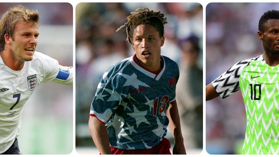
EmailPrintOpen Extended ReactionsThe FIFA World Cup is the biggest stage in soccer. It's where the game's biggest stars can shine brightest and write themselves into the history books, while smaller nations can become famous on the global stage.It's also a fashion show, as countries flaunt their very best looks that most represent who they are in kits that have been designed for years, knowing that billions of people will see them, and that their fit is how they'll be remembered forever.World Cup kits were very spartan when the tournament started in 1930 and teams only had one strip, so they could end up in a situation like the first final, when Argentina and Uruguay were both in light blue tops.- 2026 World Cup kit ranking: Forget who won final -- who had best jersey?- DJ Erling Haaland? How the Man City star is enjoying his summer- Premier League 2026-27 kits: Ranking every jersey releasedShirts got more design elements when the tournament resumed after World War II, and in the 1970s, manufacturers started putting their marks on the strips. By the 1980s, brands saw them as a chance to get attention, so they invested more in design, and by the 1990s, technology had advanced to allow for truly intricate patterns. That's what made them fashion, and it's why many of the most beloved kits came from that decade.By the turn of the century, technology pushed kits into performance wear, so design took a back seat, and then the ability to mass produce them for sale became a bigger consideration than how they looked on the pitch. Still, after nearly 100 years and all these evolutions, the World Cup has delivered some truly tremendous kits through it all. Which are the best, though?Behold, after this summer's 48-team tournament, the 48 best World Cup kits ever. 48. Japan home | 2018 | AdidasJapan's flag is white and red, but they've primarily worn blue kits for nearly a century. The tradition dates to the early part of 20th century, when it was a university-driven sport in the country, and the blue stuck. A couple of stints in white and red were unsuccessful, so the Samurai Blue remain well named, and their best blue strip came in 2018. The dots across the front of the shirt are inspired by old samurai armor, giving it a nice cultural nod, but more than anything, it looks sharp. 47. England away | 1966 | UmbroThe kit that England wore to win their only World Cup was as simple as it comes. It was red all over with the Three Lions crest on the chest, and that was it. No trim, no frills, nothing. But it was the kit they won the World Cup in and, funnily enough, the final was the lone time they wore it the entire tournament, so this is truly a kit for champions only. 46. Belgium away | 2026 | AdidasThe 2026 World Cup had few remarkable primary kits but many stunning change strips, and Belgium's was the best of the bunch. Inspired by Belgian surrealist artist Ren Magritte, the kit's use of pink and blue is lovely and not only works on its own merits as a piece of art but is fantastic from a sporting perspective because pink is so rarely seen in international soccer. Lest it be too fanciful and not fit on a pitch, the strong black trim ensures it still looks like a kit, and the black-and-white crest puts a gorgeous little bow on it. 45. South Korea home | 1994 | RapidoSouth Korea have always worn a red primary shirt and often looked quite good, but they switched things up exactly one time to great success. They debuted this loud design the prior year, but in red and blue. Then for the World Cup, they replaced the red kit with this white version that brings in the red and blue of the country flag plus a little yellow for added pop. This beauty, which kept the colored design on the shorts and socks, marked the final time we saw South Korean company Rapido outfit the Taegeuk Warriors. 44. Cameroon home | 2002 | PumaThis isn't actually one of the best World Cup kits ever, but it is one of the most memorable because it was intended to be sleeveless, as Cameroon wore it at the Africa Cup of Nations. FIFA didn't let the Indomitable Lions let their arms shine at the World Cup, though, claiming there needed to be sleeves for the World Cup patch, so Puma added a black sleeve. It still looked pretty good, but this will always be remembered as the kit that wasn't. 43. Honduras home | 2014 | JomaSometimes it's the little things that make a kit. Honduras' 2014 outfit was, at its core, just a white shirt with white shorts and white socks, all trimmed in blue, but take a good look at the crest. Well, it's not really a crest. It's a big "H," but inside of it, there's "Honduras" in a nice script and the five stars you can find on the flag. It's beautiful and would have looked even better on the blue kit that FIFA never chose for them to wear at the World Cup. 42. Canada away | 1986 | AdidasCanada showed up to their very first World Cup looking phenomenal. The pattern on the red shirt was terrific, and the strong white collar, as well as the Adidas three stripes, really pop, but what makes it is the gorgeous font that spelled out "Canada" across the front. It's extremely 1986, which is a compliment. Canada have qualified for two World Cups since, but they haven't looked as good as they did in either of the kits from their first trip. 41. Portugal away | 2010 | NikePortugal's red and green is iconic, but since a green kit doesn't differ enough from their primary red -- they've always been a bit boxed in by their change kits. They usually wear white and try to go with a bold design, but while many have failed, their 2010 edition sung. The center stripe of both red and green is smart and tasteful while screaming "Portugal." The green shorts and green stripe on the socks were a nice touch, too. 40. Tunisia home | 1998 | LottoTunisia went to the World Cup for just the second time ever in 1998 and made sure people were not going to forget them. The bold swooshes up and down the kit were beautiful and the way they inverted with the white on the shoulders was gorgeous. Lotto nailed this look -- even down to the little detail of the stripe at the top of the socks -- and the change kit, which was a white version of the same design, was aces too. 39. Senegal home | 2022 | PumaLots of teams at the club and international level have tried on chevrons, but few have really pulled them off, and none as well as Senegal in 2022. White home kits can be forgettable, but the tricolor design of the chevron, which uses the bold yellow most prominently and also works in red and green to mimic the flag, is a perfect way to make it feel personalized and unique. It also frames the crest and Puma logo beautifully. 38. Romania home | 1994 | AdidasRomania have made the quarterfinals of the World Cup precisely once, and it came in this wonderful 1994 strip. Coincidence? The yellow didn't come across as overwhelming because the red and blue accents on the trim and sides helped make this very bold attempt seem cohesive and thoughtful. Shirts and shorts can often seem like two separate pieces, but the matching accents on the sides of both made this Romania kit come together beautifully. 37. Chile home | 1998 | ReebokReebok thought it would get clever and skirt rules about the size of manufacturer logos by making a gigantic design element in the shape of its logo on Chile's 1998 kit, but FIFA saw through it and made the company ditch the giant Reebok logo on the right shoulder. The solution was even better, as the single white streak perfectly framed the manufacturer logo, while the Chile crest, set against white, popped on the red next to the bold design. The pattern on the collar was just the type of small detail that really elevates a kit, too. 36. Algeria home | 1982 | SonitexAlgeria's 1982 World Cup is not often remembered fondly after the Disgrace of Gijn, where West Germany and Austria conspired to draw so the Fennec Foxes would be eliminated. But before the cruelty of semi-competitive sport bit Algeria, they looked resplendent in their Sonitex kits that featured the country name in Arabic across the front. The main kit, which was primarily white with green sleeves and green down the left side, was particularly good and would have been remembered by everyone who saw them if they weren't overshadowed by the shenanigans in Gijn. 35. Croatia home | 1998 | LottoIt's hard to find a standout Croatia kit because when you're always rocking red-and-white checkers, aren't you always a standout? This is the best of the bunch thanks to the red-and-blue accent on the collar and the way the checkerboard only making it two thirds of the way across the shirt actually looked like it was waving when they sprinted down the pitch in those very 1990s baggy tops. The iconic kit from a country whose look is already iconic. 34. Peru home | 1978 | AdidasPeru have been to five World Cups, and other than at the very first one in 1930, they've donned their gorgeous white shirt with a red sash. The best of those looks came in 1978, when they shrank the sash just enough so it didn't get cut off by the neck hole and had a little extra red from the Adidas stripes on the sleeves to go along with a smart collar. 33. Cameroon home | 1990 | AdidasAny kit that mirrors the flag is beautiful, and Cameroon's green shirt, red shorts and yellow socks look is one of the best. Their 1990 edition was particularly good with the big white accents all over the top, but especially because they had a giant yellow crest that really stood out and tied the whole kit together with the yellow socks. 32. Norway home | 2026 | NikeSpeaking of kits that mirror the flag, how about this one? Norway threw the flag straight onto this top and it worked amazingly. Take the crest off this one and even someone who had never seen this kit would immediately know what country this was. It even framed the badge well, and when paired with white shorts and blue socks, it was extremely Norway without being obnoxiously loud. 31. England home | 2006 | UmbroEngland have one of the most famous kits in the world, but they're not often design masterpieces. This is the problem with a white primary strip, but their 2006 shirt pulled the Saint George's Cross from their flag and slapped it on the shoulder in a modern look that seemed fresh while also totally England. It was terrific and would be remembered more fondly if the Three Lions' trip to Germany hadn't become more known for wives, girlfriends and drama than the disappointing play on the pitch. 30. South Africa home | 1998 | KappaSouth Africa were not eligible for the World Cup until 1994, first for not being a FIFA member and then being banned from competition over apartheid, so it was a big deal when they made their debut in 1998, and they were sure that everyone would remember they were there with a kit nobody could forget. Kappa gave them hoops, some in yellow and some in black, except for the right shoulder, where the stripes stopped, as well as a green collar and black trim. No other team has ever had a kit anything like this, and it's exactly the type of eye-catching look befitting of a country making its entrance onto the biggest global stage. 29. Japan away | 2026 | AdidasJapan's effort this summer was perfect, with the multicolored vertical stripes of this away top playing with the strong, bold black and white of the trim and crest. Fortunately, the Samurai Blue made the knockout stages and got to wear this beauty since FIFA foolishly kept them out of this kit in the group stage, and it would have been a shame if we never saw it on the pitch at a World Cup. 28. England home | 1990 | UmbroYou probably saw tons of England fans in throwback 1990 kits this summer, but it was the light blue third kit that never made it onto the World Cup pitch. Their white shirt from that year did feature at the tournament, and it was a smart look that used a blue collar and intricate sleeve trim to elevate it into one to remember from the Three Lions' semifinal run. 27. United States home | 1950 | In-houseThe Americans have tried a lot of ways to make their white primary shirt memorable, often to little success, but go back more than 75 years and you will find a great look. The white shirt with navy trim is made a beauty thanks to the strong red sash across the chest. The outfit screams "USA" without being overly bombastic and remains one of the best they have ever worn, so much so that the 2006 red third kit inspired by the 1950 shirt is still one of the most sought-after jerseys among U.S. fans. 26. Belgium home | 1982 | AdmiralBelgium had one of the first intricate World Cup kits when they went to Spain in a red strip that had swooping yellow lines from shoulder to thigh with little black crowns. It's a kit that would have fit in well a decade later, but almost nobody was doing it like this in the 1980s. Crowns don't exactly scream "Red Devils," but you can't deny that it's fly and absolutely stood out at that World Cup. 25. Yugoslavia away | 1990 | AdidasYugoslavia's final World Cup kit before the country dissolved was terrific. The side panel design of blue and red was bold, while the blue stripes in the middle were matched on the sleeves for a look that extends beyond just the ribs. Add in the red and blue for the three stripes on the shoulders and the subtle pattern on the white that gives it some texture and you have a work of art. That they had a matching design in blue for their home kit made it a wonderful aesthetic World Cup farewell for the nation. 24. Poland home | 1982 | AdidasAdidas had it going in 1982 with a ravishing template featuring neck and sleeve trim, three stripes on the shoulders and a thin pinstripe that looked particularly good on Poland. The red stripes gave a satisfying dimension to the white shirt, and the red crest with the distinctive eagle looked outstanding in the center of the shirt. 23. France home | 1982 | AdidasFrance got one of Adidas' template kits in 1982 too, but with a slight change. Their blue shirt had a white collar with blue and red stripes on it that looked great, and the gold rooster from their crest was resplendent on the chest. Add in the three stripes down the sides of the white shorts coming in red and blue to go with the red socks and you had one of the best tricolor kits France have ever worn, which says a lot for a country whose blue, white and red strip that matches their flag is among the best in the world almost every time out. 22. Northern Ireland away | 1982 | AdidasOne more from Adidas' 1982 range is Northern Ireland's outfit from their return to the World Cup after a 24-year absence. They sported a white shirt with the thin stripes in green and a green collar, green shorts and white socks with green stripes. What really made this kit stand out, though, is the oversized crest, which brought the big cross into frame and gave the eye a nice Green and White Army focus point on an otherwise tidy, but simple, kit. 21. Italy home | 1994 | DiadoraThis was such a 1990s shirt, from the sublimated pattern, to the goofy font, to the gray drop shadow, but it really worked. It managed to take the goofy, occasionally corny aesthetic from the decade and make it look composed and professional while maintaining the fun and bombast. This would have been an all-timer had Italy won the tournament, giving it the weight of a World Cup winning shirt, but it's still one of the Azzurri's best. 20. Spain home | 1994 | AdidasSpain own the red-top-with-blue-shorts game. When you see it, you think of La Roja, but oddly enough, they've had very few good primary kits. They absolutely had it going in 1994, though, when Adidas used a blue-and-yellow diamond pattern down the right side of the shirt and left side of the shorts to create a stunning kit. It was distinctive, and the yellow trim on the blue collar to go along with the block number font completed the look perfectly. It was so good that they tried to bring it back in Spain's 2018 kit, to much less success. 19. Angola home | 2006 | PumaAngola have been to one World Cup, and they had the kit on when they went to the globe's biggest stage. The black and yellow stripes across the front of the shirt were meant to mimic traditional body paint, and the way it's not just two big stripes, but featuring smaller ones too, gives it detail and composition that work nicely. The crest and number coming in above the stripes on each shoulder balance out the kit well, and the two-tone socks round everything out so, while Angola are not a World Cup regular, we remember their trip. 18. Denmark home | 1986 | HummelHalf-and-half kit designs are rare, and when we do see them, they're usually simple two-colored. But a half-and-half kit with a solid color and a pattern? That's what Denmark went with at their first World Cup in 1986. Combined with the Hummel arrows down the shoulders and side, and large, italicized font, it gave the illusion of speed, and because of the touches of black in the numbers and collar, it somehow managed to come off composed and cohesive despite so much going on. It also helps when you have Michael Laudrup wearing it, leading, to that point, the best team in the history of the country. 17. Nigeria away | 1994 | AdidasNigeria have had some spectacular green outfits, but this is their best white look. The green-and-black geometric pattern is beautiful and unique, but then putting it in blocks and checkering them across the kit with simple white adds another layer of pattern and creates a texture that is hypnotizing. It doesn't become overwhelming because it's paired with simple green shorts and white socks to make for a mesmerizing kit from head to toe. Well, except for when they wore it with matching shorts. That's a lot. 16. Brazil home | 1958 | AthletaBrazil's canary shirt with blue shorts is arguably the most famous kit in world soccer, but that was not their original strip. They wore white shirts at the first World Cup and continued in that look through 1950, when a loss to Uruguay in the final at the Maracan� embarrassed them so much that they demanded the kits be thrown away. A contest was held to design the new Brazil kit and a yellow shirt with green trim and blue shorts won out. Funnily enough, the winning submission came from a Uruguayan, but Brazil have certainly made it their own since, beginning in 1958 when Pel wore it to win the country's first World Cup and changed the iconography of the sport forever. 15. Germany home | 1994 | AdidasFew countries have found success with a design pattern the way Germany have with their tiled kits. The 1994 edition was gorgeous, with the red, yellow and black making their way up the shoulders all the way to the collar. That is where Adidas smartly used a yellow-and-red collar that breaks up the pattern but still blends in well while bringing needed constraint so that everything feels well considered. Add tile to the left side of the shorts and you have one of the best kits the World Cup has ever seen. 14. Argentina home | 1986 | Le Coq SportifAn Argentina home kit had to make the list. It was just a question of which one, and 1986 wins out for two reasons. One, Le Coq Sportif did a great job keeping it simple with a white trim so it looked classic and handsome. Two, Argentina won the World Cup in this kit, with Diego Maradona iconically sporting this strip while being hoisted into the air and raising the trophy above his head. 13. Spain away | 2026 | AdidasSpeaking of winners, Spain donned their best-ever World Cup kit en route to winning this year's tournament. They have had a variety of change kits in different shades of blue and yellow, and a handful of white looks that are mostly forgettable. This one wasn't, thanks to a deeper shade of red and gold trim that looks magnificent. Simplifying the crest into red and white really works, and when La Roja wore this shirt with red shorts, it was a wonder to behold. That the World Cup trophy just so happens to perfectly complement this kit can't be a coincidence. This beauty was made to be worn by a champion. 12. Colombia home | 1990 | AdidasColombia's yellow is one of the best looks in the world. That's partially because of how it looks on the pitch but mostly because of their rabid fans who travel the world and make any stadium Colombia plays in a sea of yellow. The question is which Colombia yellow kit is best, and it's 1990 that wins out as the red and blue coming off the sleeves give it a distinctive look, and the additional red on the Adidas three stripes makes the whole kit seem brighter. When paired with blue shorts and yellow socks, it's brilliant. Add in Carlos Valderrama's hair and it's transcendent. 11. United States away | 1994 | AdidasThis kit was so good that Adidas recreated them with no crest because they no longer hold the U.S. Soccer contract, and they still flew off the shelves this summer. The denim-inspired kit is so 1990s and was mocked at the time, but the look is uniquely American and, well, just straight up unique. No country or club has worn anything like it since and that's why, in a world where tens of thousands of kits have been made, this is the rare one that when you see it, you immediately know what it is and which team wore it. This is another example of a kit that could have gone wrong without a strong collar and trim, but it has those constraining the big, unusual design and making it work. 10. Netherlands home | 1974 | AdidasThis marked the first time Adidas' three stripes were seen in a World Cup final. The logo wasn't seen on Johan Cruyff's kit, though, as he had a deal with Puma and fought not to wear the Adidas marker, so his shirt had only two stripes. It's a fun quirk of a kit that highlights how sometimes all you need is your team color, a nice crest and the littlest bit of trim to make a classic kit. At least when you wear a color so associated with you, like the Netherlands and orange. The only thing missing was Cruyff lifting the World Cup trophy as the Dutch fell in the final. 9. Republic of Ireland away | 1994 | AdidasAfter qualifying for their first-ever World Cup in 1990, Ireland might as well have been veterans when they went back four years later, and they were dead set on making sure people remembered them. Their kit did the job with three bold, green stripes across the front of a white shirt, only the stripes faded out before they made it to the bottom of the jersey. It was certainly unique, but it was still well composed, with the crest, number and Adidas logos all perfectly framed in the green stripes at the top. Unfortunately, Ireland didn't win any of their three games in this kit, and their lone victory at the World Cup came the one time they wore green. 8. France home | 1998 | AdidasThis kit was always going into the history books when Zinedine Zidane lifted the trophy over his head in it and made France world champions for the first time ever on home soil, but this was an instant classic before Les Bleus made their tremendous run at the World Cup. The gold rooster looked as good as ever and the strong red stripe across the front, with three thinner white stripes underneath, was inspired by their 1984 kit, which France donned en route to the Euros title. This World Cup made it two-for-two on major trophies in this design, so not only is it superb, but it's also good luck. 7. West Germany home | 1990 | AdidasWest Germany had won two World Cups, played in three more finals and captured a pair of Euros by the time the 1990s came around. Arguably no team had played in as many gigantic matches as the Germans, and that made their simple, plain white shirt with black trim one of the best known in the world, so it was a big departure when they added ... color. It was a welcome change, though, because Adidas did such a fantastic job when red and yellow entered the equation with this zigzag pattern across the front. Bold, dazzling and, despite being such a change from the only look the World Cup had known West Germany for, it still screamed "Die Mannschaft." That they proceeded to win their third World Cup in it just made it so they'd be in the soccer history books as well as the fashion history books. 6. Japan home | 1998 | AsicsThe theme for Japan's first-ever World Cup was fire. That they had a goalkeeper kit with flames all over it was one thing. After all, this was the era of Jorge Campos, when outrageous goalkeeper kits weren't uncommon. But the Samurai Blue took it to their outfield shirts with large flame designs up both shoulders. It worked, mostly because it was somehow still restrained. The flames were only outlined and the rest of the kit was a simple blue with a white collar and smart red stripe. The biggest pop of color came from the yellow on the crest. A classy flame kit? That's fire. 5. Nigeria home | 2018 | NikeThe best kit of the 21st century is no surprise, considering this shirt was lauded in every corner of the internet, flew off the shelves and was complimented every time Nigeria pulled it on. Though people generally want a classic kit that is timeless and could be worn in any decade, the very best are extremely of their time and feel like they could only be worn at that specific World Cup. That's what this Nigeria kit does. It is so 2018, both in its modern style and the way it pulls black into a Nigeria kit more than ever before at a time when sports fashion was pulling black into anything and everything. That Nike did that without losing the essence of Nigeria, still letting the classic green shine, is a work of art. The only problem with it is FIFA wrongly let Nigeria wear it just once in Russia. 4. Netherlands home | 1994 | LottoIf 1974 was the simple, basic Netherlands that just let the orange shine, 1994 was when they went big. It's still the classic Dutch orange, but the lion from the crest is sublimated all over the kit. It is somehow both subtle and, when you focus in on it, brash. The white collar with blue and red trim, colors taken from the flag that are also on the sleeves, really round this one out. It is maybe the most Netherlands kit they've ever worn. 3. Jamaica home | 1998 | KappaThe Reggae Boyz have qualified for only one World Cup, but they made it count aesthetically. Their typical yellow shirt with black trim added green in an intricate design down the right. That alone would have made for a great kit, but that design carries down onto the black shorts, which are green on the bottom of the right leg. Sometimes, the work of a great kit is really done only on the shirt, but Kappa absolutely nailed this one from head to toe. Jamaica have had other fabulous kits, so it's long past time for the Reggae Boyz to kick it into gear and qualify for more World Cups so we can see more beauties like this on the biggest stage. 2. Brazil home | 1994 | UmbroEvery yellow Brazil kit is good, but this one is their best on its merits. That they won the World Cup in it just cements its place on the mountaintop. The yellow trim on the green collar, as well as the green trim against the yellow on the sleeve trim, is very smart, but where it stands out is how the crest is sublimated diagonally three times across the chest. It's bold without being overwhelming, and it looked especially good in the sunlight, like when they lifted the sport's ultimate trophy. This was Umbro's last Brazil kit before Nike took over the contract, and it was one hell of a way to go out. 1. Mexico home | 1998 | ABA SportABA Sport made kits for only a decade, and it outfitted its home country of Mexico for only a single World Cup, but it made it count with the best strip to ever feature at the tournament. Tapping into Mexico's pre-Hispanic roots with the Aztec sun stone, the kit is mesmerizing and arguably the most distinctive in the history of the sport. You could strip it of the crest and nobody would question for a second which country wore this kit. It is so uniquely Mexico and screams "El Tri," but the way it uses white and red on both the collar and sleeve trim helps make it a fully formed kit instead of simply an inspired, gorgeous design. Throw in the white shorts and red socks, making the iconic Mexico tricolor, and you have the World Cup's best ever kit.