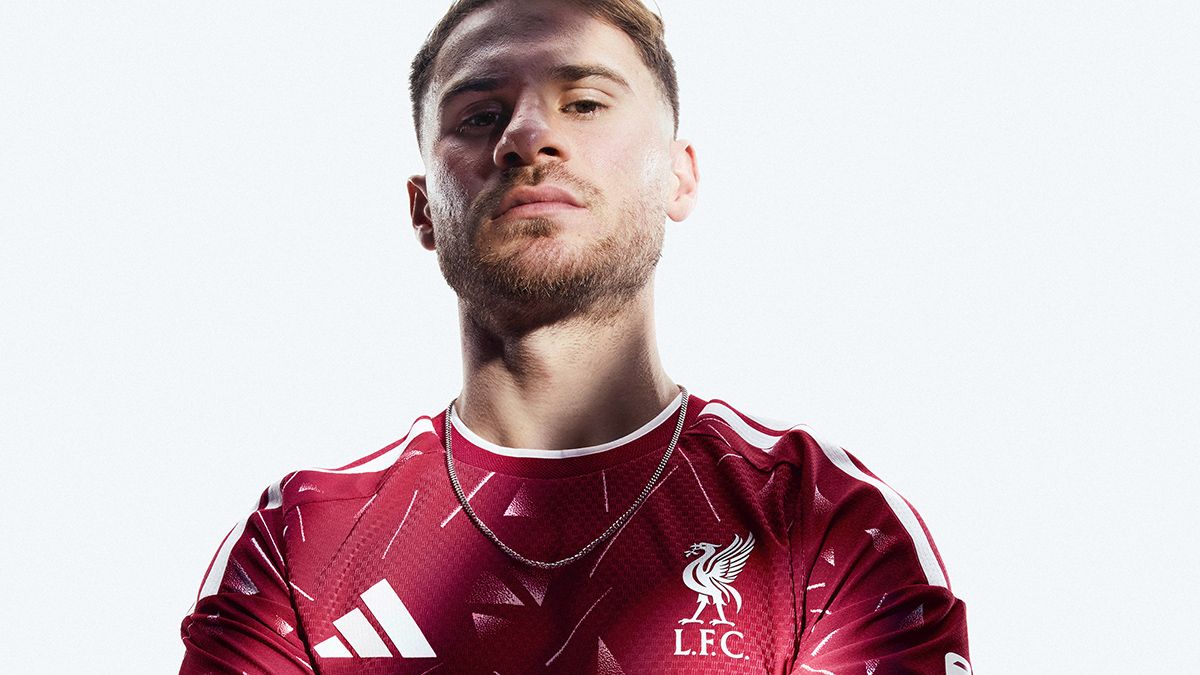
Copy linkFacebookXPinterestEmailShare this article 0Join the conversationFollow usAdd us as a preferred source on GoogleNewsletterSubscribe to our newsletterThe new Liverpool home kit for the 2026/27 season has dropped and it might just prove divisive.Retro is never out of fashion, and Adidas have reached back into their Liverpool archive to get inspiration for their latest effort.The question is have they actually improved on the original design by updating it, or simply made fans yearn for the original?Latest Videos From You may like The Manchester United home kit for 2026/27 is out - and everyone's saying the same thing The Arsenal home kit for 2026/27 is out - and it will look great with a gold patch The Celtic 2026/27 home kit is out and this might be the most popular for years Liverpool go back to famous Sir Kenny Dalglish title triumph with latest kitThe kit is a modern take on the kit that Liverpool wore from 1989 to 1991, including the Reds' 18th title win in 1989/90.That made it the last home kit of Liverpool's golden era that had extended back nearly 20 years into the early 1970s - and it would be another three decades before Liverpool finally got their hands on the top-flight trophy once again.Liverpool 2026/27 home kitThe painterly pattern is back for the Reds, in what will be a hugely nostalgic shirt for some fans and confuse some younger supporters.View DealThe original kit featured jagged, faded triangles that only really turned white at the very tips, but the pattern on the 2026/27 effort demands to be seen much more loudly.Those triangles are back again, not-so-subtly suggesting the adidas logo at points, and are joined by some rather jazzy, very clear white lines. You can make your own Robbie Fowler goal celebration joke here.Get FourFourTwo NewsletterThe best features, fun and footballing quizzes, straight to your inbox every week.Contact me with news and offers from other Future brandsReceive email from us on behalf of our trusted partners or sponsorsBy submitting your information you agree to the Terms & Conditions and Privacy Policy and are aged 16 or over.We suspect that may be divisive: some fans might like that adidas have found a way to bring a bit more visual interest to a kit that doesn't typically offer much room for interpretation. Others might feel like it looks like a child's duvet cover from the 1990s.Adidas have tried to balance out having more white than usual on the kit by using a slightly darker shade of red than usual, which makes it feel a bit more like some of Reebok's early 2000s efforts than anything else. Lighting is a factor, however: in many lights, it is unmistakably Liverpool.There's a green goalkeeper kit version of much the same design, too, in keeping with Bruce Grobelaar wearing a similar effort concurrent with the previous 80s-90s outfield red.Image 1 of 5Fans who care about such things may be a bit disappointed that the shirt features the standard three-stripe adidas logo, rather than the trefoil design. That's not just because it has for some reason become a prestige symbol among discerning kitheads, but also because the original did feature the trefoil.That makes it feel like adidas have gone further and louder than the original design, but left off the touch of class that would have made it feel like an instant retro classic.What do you think? Leave your comments belowTOPICSLiverpoolSteven ChickenSocial Links NavigationSteven Chicken has been working as a football writer since 2009, taking in stints with Football365 and the Huddersfield Examiner. Steven still covers Huddersfield Town home and away for his own publication,WeAreTerriers.com. Steven is a two-time nominee for Regional Journalist of the Year at the prestigious British Sports Journalism Awards, making the shortlist in 2020 and 2023.