
Adidas have unveiled the Manchester United 2025/26 away kit and this one could be polarising.
The Red Devils' home shirt has already dropped and is a phenomenal throwback to the 90s, as one of the classier Premier League kits released so far this summer.
Ruben Amorim will be hoping for better days ahead after enduring a largely miserable time of it since taking the job last year at least as far as domestic competition is concerned but United fans will be thinking about happier, simpler times once again as their side take to the field in a simple, almost retro white away kit with few flourishes.
Manchester United away kit goes back to basics
Manchester United have tended to go with a pretty straightforward white kit for at least one of their strips over the past few years, and Adidas have chosen to stay the course this time around.
The general thinking around kits is that you go classic with the home kit, then use your other two strips to have one that is simple and classy to appeal to those with a more reserved sartorial palette, and another that's a bit louder and more vibrant for a more youthful look

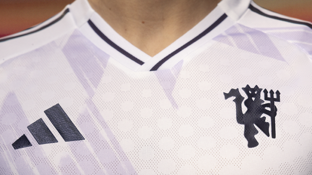
This effort falls squarely into the more urbane category. The simple white strip is entirely in monochrome, eschewing the red flourishes that have tended to feature on more recent white efforts.
The only exception is a pattern for some reason resembling the peaks of the Canadian flag running in a faded lilac pattern diagonally across the shirt. That may well be a bid to stop it from looking entirely like a mid-late 2000s Real Madrid shirt but there will be plenty who don't like it for that reason.
The Adidas stripes, Snapdragon sponsor logo, and the club's devil logo are all rendered in dark purple, with a couple of single black stripes running from the bottom of the V-neck and up the collarbones.
For this seasons away jersey we wanted to reimagine one of the clubs most iconic graphics of the past, and reinterpret it for the modern day in a bold new way through an updated colour palette, Juergen Rank of Adidas tells us, adding, The rich purples work in harmony with the white base and metallic detailing, and were excited to see it on-pitch and in the stands this season.
In FourFourTwo's view, the kit's barebones aesthetic works - but there's one feature we're not big fans of. The sleeve stripes are interrupted by a white band for the competition badges and shirt sleeve sponsors to occupy.
While that is a practical solution and will look smarter on the pitch, it would look a bit daft on a bare replica strip. But hey, who buys the long-sleeved version anyway? It'll be grand on the short-sleeved version.
TOPICS